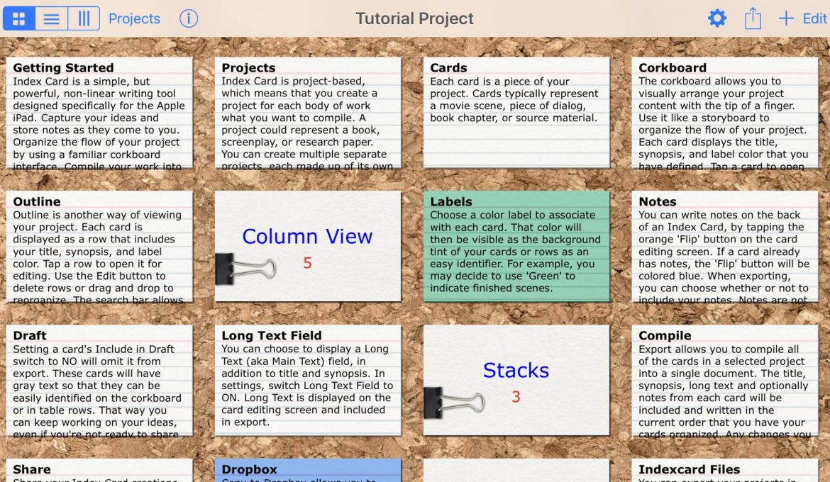
Not long ago we found this awesome iPad app, Index Card, that lets you plot and plan your story on. For so long, we’ve contended with trying to plot and plan in an organised, effective way when jotting down ideas for stories. We’d store them on a document and try to categorise them so it’s easier to see the story we’re developing. As ideas start to flow, branch out and span pages, we find we start losing sight of what we’ve developed, where the story is going and what we want to do with it. The Index Card app definitely makes plotting and planning so much easier. Ideas are organised and they are so much more visible with this app. We love it!
Index Cards is a simple app. Just looking at it from screenshots—and even when you first load the app—you wonder how much could this app organise ideas and help out plotting and planning, or even drafting an entire script? It’s just a cork board that allows you to add index cards on a screen. It is indeed just that, but it’s two-level cork board, stacking/grouping feature and the ability to expand on ideas noted on index cards is what’s so useful about this app.
You can stack them together, categorising your ideas in a nice set. Clicking the set brings all the individual index cards up on a 2nd-level screen. (You can’t group index cards beyond the first screen.)
The index cards do scroll vertically so you are not limited by a character limit. If you want to expand on an idea on an index card, you can write them on a page that’s attached to that index card.
There are multiple views available, too—which we really like.
In the Grid View (the default view) you are presented with a cork board (you can change it to a black or white background) and the index cards are displayed in a grid. You can create individual cards and stack the cards. The cork board is scrollable vertically, so you can add cards beyond the number that will fit on the screen.
The Column View will show stacked cards in their respective columns. So if you had grouped a set of index cards into something like “Act 1”, in the column view, they will be displayed in a column called “Act 1”. Index cards not stacked, i.e. individual cards, will each appear in separate columns. In this view you can scroll both vertically and horizontally, allowing you to have many index cards down a column, and many columns across the screen. We haven’t tested what the limit is, however.
The third view is the Outline View. This view automatically creates an outline of all the index cards. It includes all information from the index cards: all the headings and descriptions, but it does not include the content written in the expanded notes page attached to the index card in this view. To see the expanded notes from the page, you have to bring up the index card by clicking the outline and access it that way.
When you’re done with the planning and plotting—you could probably write the entire script using the app, too—you can export it as PDF, TXT, or RTF; export it to Dropbox; or sync your projects with Scrivener (we don’t personally use the last two, but it looks similar to Index Cards app). You can also share with your Index Card projects with other Index Card users as well; so it’s great for collaborating ideas, too.
This app has really helped us organise and collaborate ideas so much more effectively. We love it!
ADVERTISEMENT


